Tagged: infographic
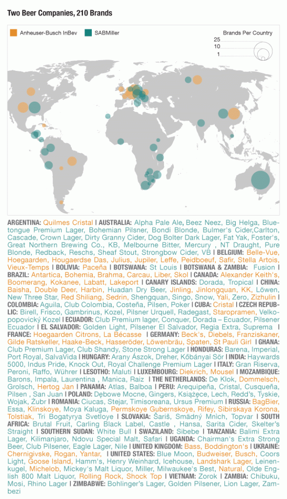
Macro-Map: Beer Industry Consolidation
Being a brewer people occasionally ask me about the often quoted statistic “Anheuser-Busch spills more beer per year than the entire US craft beer industry produces.”
I seriously doubt that this volume differential has ever actually been measured but this info-graphic should give you some idea why it is certainly plausible:

